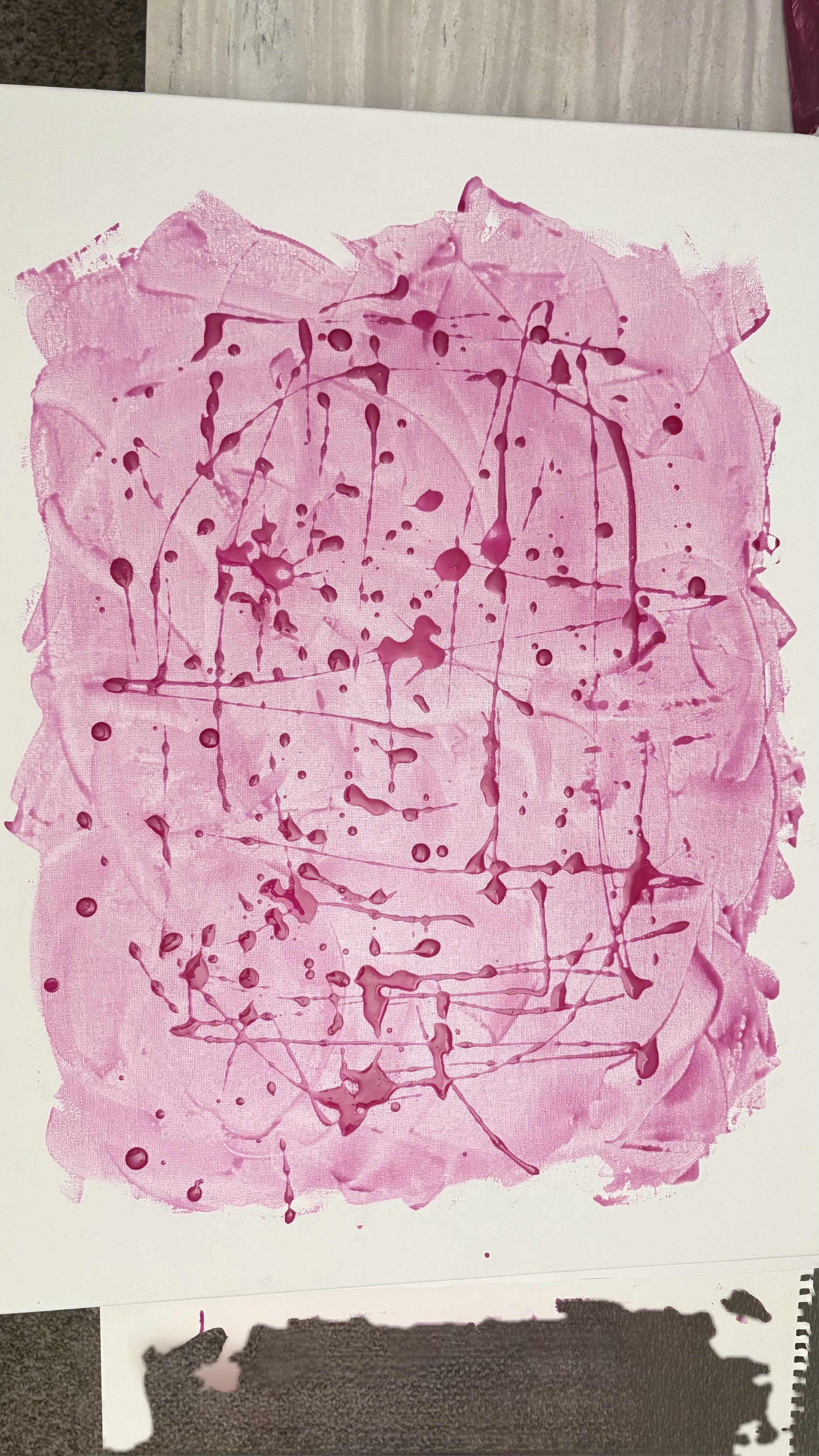
Palm Springs Pink
Color. Light. Origin.
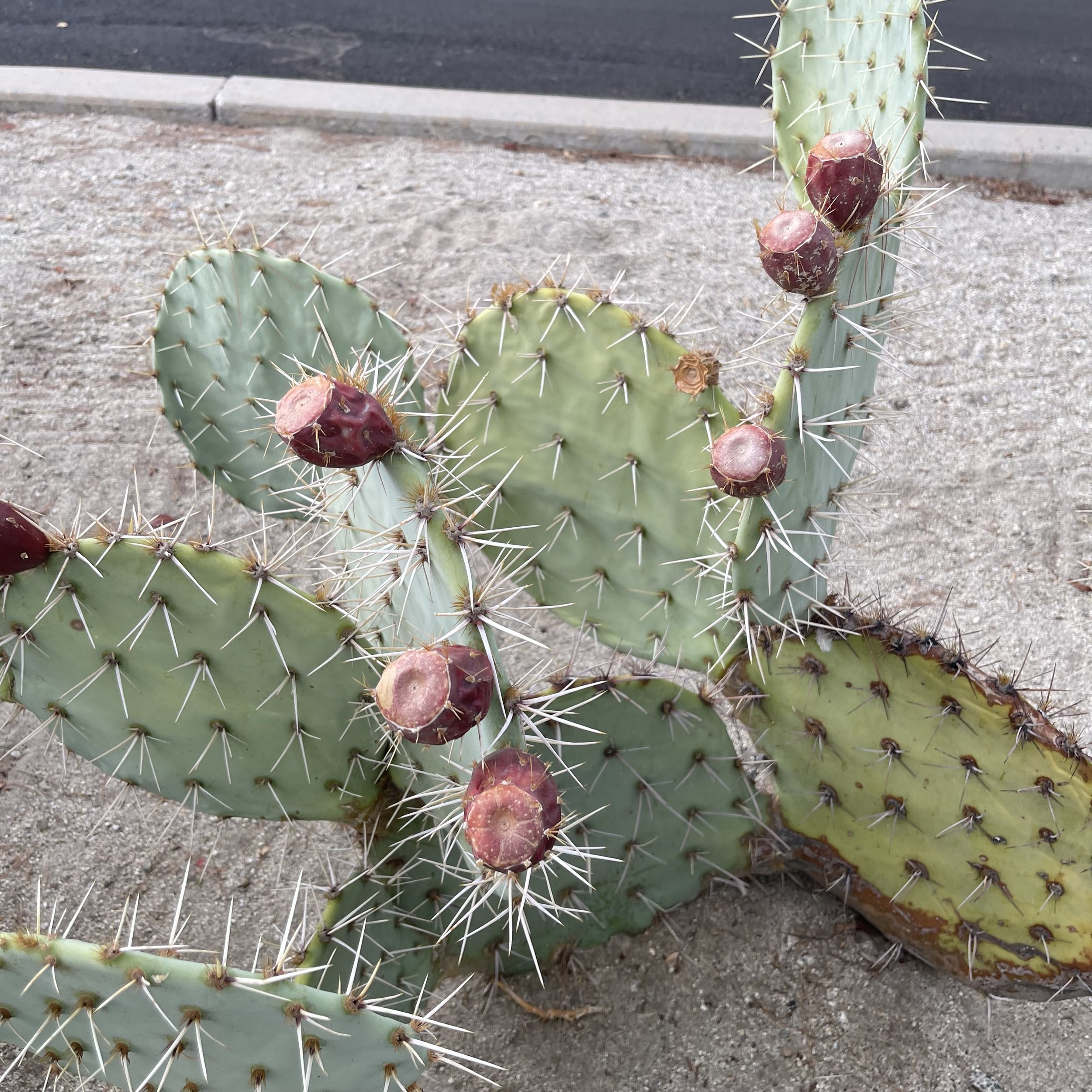
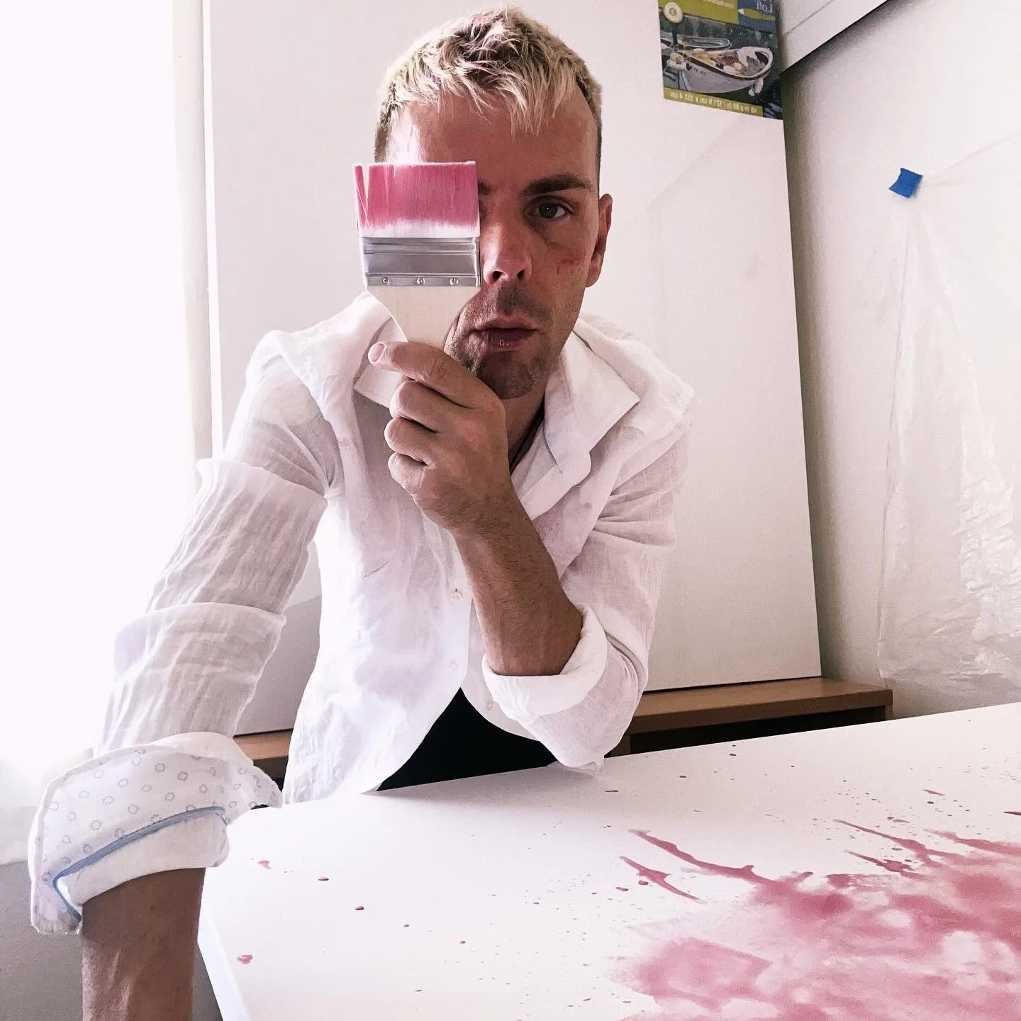
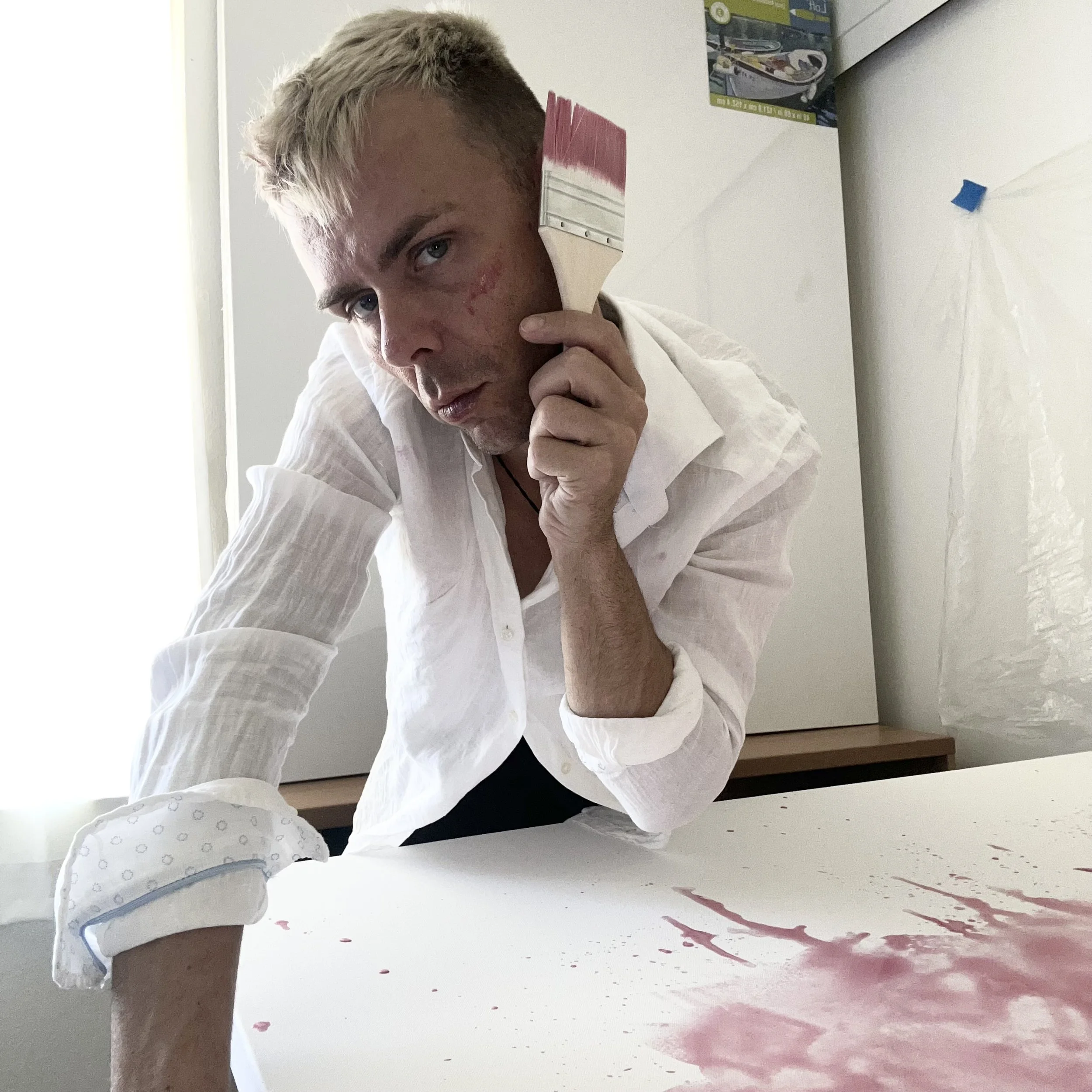
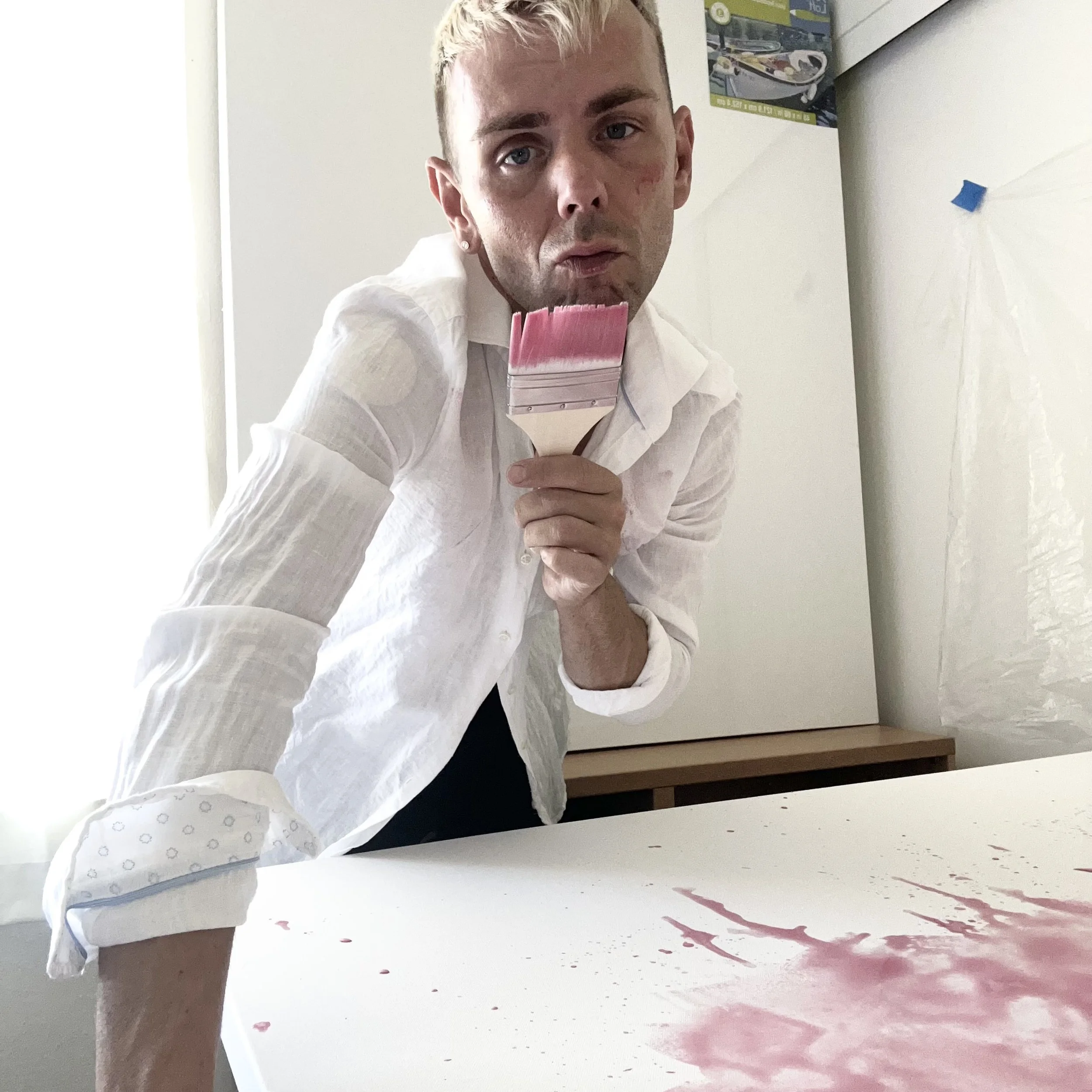
Palm Springs Pink is a naturally derived pigment and body of work created from the barbary fig cactus, harvested and distilled by hand in Palm Springs, California. The fruit is slowly transformed into paint without synthetic binders or harmful chemicals, resulting in a color that is both ancient and unexpectedly contemporary—nearly identical to what culture now calls Barbie pink.
Produced in limited seasonal batches, subject to the cactus harvest from October through January, the medium exists at the intersection of ecology, material innovation, and art history. Palm Springs Pink can be applied across a range of forms, from translucent watercolor washes to richly layered, acrylic-like surfaces, each exploring color and light as the sole subject.
Influenced by the legacy of Klein, Rothko, Pollock, Delauney and Kusama, to name a few, Farran’s work resists narrative and symbolism. Composition and movement may be observed, but meaning remains non-subjective—completed only through the viewer’s encounter with color, surface, and Light.
Fruit Forward
This body of work begins with a fig.
What most call the prickly pear, I prefer to call by its older name: barbary fig—a cactus fruit steeped in desert history, resilience, and adaptation. Harvested by hand in Palm Springs, the fruit is juiced and slowly distilled into a pigment that becomes paint. No synthetic binders. No harmful chemicals. Only time, heat, gravity, and patience.
Coincidence or not, the resulting color is almost an exact match to what contemporary culture calls Barbie pink. A color once dismissed as artificial, commercial, or manufactured is revealed here as ancient, organic, and entirely of the earth.
This is not nostalgia—it is paradigm shift.
A Slow, Green Production
The paint exists only in limited, small batches, subject entirely to nature. Barbary figs ripen and fall from the cactus between October and January, placing this work in direct conversation with harvest cycles, scarcity, and restraint. Production cannot be rushed or scaled without compromise. The process insists on slowness.
In an art world driven by speed, volume, and replication, this work reclaims seasonality as a value.
Color as Subject
This series follows the lineage of artists who liberated painting from narrative and representation—Yves Klein, Mark Rothko, Jackson Pollock—masters who understood that color and light alone could carry meaning.
These works are non-subjective.
There is no story imposed beyond the experience of color itself.
The surface is the message.
The light completes the work.
Frequency, Consciousness, and Balance
I believe art arrives from a higher frequency—not as instruction, but as alignment. The act of making becomes a form of tuning: listening, receiving, and translating rather than imposing.
In this language, the work embodies a message of universal consciousness, harmonic vibration, and balance with Mother Nature. The cactus, the fruit, the color, and the light operate as collaborators, each carrying their own frequency. My role is not to dominate the process, but to remain receptive to it.
Color functions here as vibration made visible. Pink is not merely seen—it is felt. The surface becomes a quiet field where energy, matter, and awareness meet.
This work does not seek to explain nature.
It seeks to resonate with it.
Transmutation, Not Extraction
Historically, the color carmine was derived from the same cactus—yet through a violent and exploitative process involving the cochineal insect. Thousands were crushed to produce pigment.
This work proposes an alternative.
Without harm, without chemicals, without exploitation, the cactus offers its color freely. What I believe I have discovered is a transmutation—a shift from extraction to collaboration with nature. The color remains just as saturated, just as enduring, but the method is aligned with ethics, ecology, and reverence.
Endurance & Legacy
These paintings are finished using techniques rooted in art history. They are sealed and protected in the same spirit as the great works of the Louvre. La Joconde—the Mona Lisa—has endured centuries through tempera, varnish, and care.
Longevity matters.
Sustainability is not only environmental—it is temporal.
The Spiritual Language of Pink & Cactus
Pink is the color of compassion, softness, and universal love. It occupies the space between passion and peace, strength and vulnerability. Spiritually, pink dissolves aggression and invites empathy.
The cactus, meanwhile, is a symbol of resilience, boundaries, and quiet survival. It thrives where others cannot. It stores water. It protects itself. It teaches patience.
Together, they form a philosophy:
gentleness does not mean weakness.
Palm Springs Pink
Because this paint was conceived, discovered, and refined in Palm Springs, it bears the name Palm Springs Pink—placing the desert once again at the center of cultural innovation, not as backdrop, but as source.
This color does not belong to industry.
It belongs to place.
It belongs to time.
It belongs to light.
